

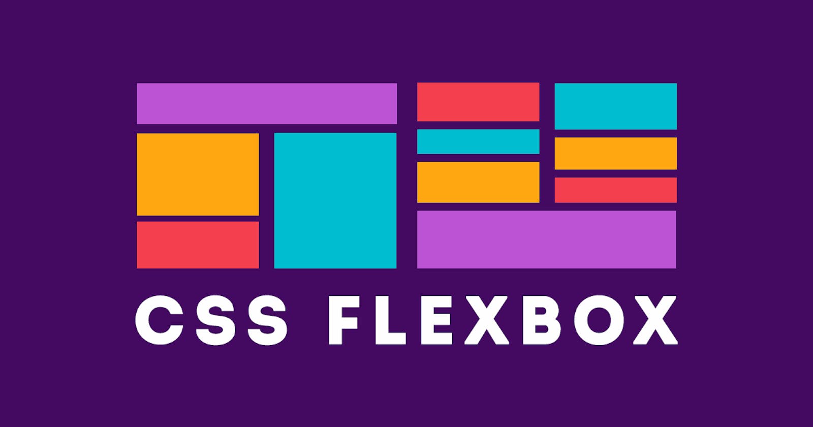
Hey there! Ever wondered about even doing so many courses and still couldn't memorize all CSS properties? If "Yes" then Welcome to the Club! Not only you, but most of the developers except some (those are Aliens👽) are also like this. So it is advised to have a cheat sheet along with you for reference(You can bookmark this page for Flexbox, I won't mind 😉). Okay, let's stop talking and jump into the content.
The main reason behind the Flexbox is to provide us a more convenient way to layout, align and distribute space irrespective of their sizes. First of all, Flexbox is not a single CSS property, consider it as a separate whole world that has its own properties. The direction of the Flexbox is based on the flex-flow direction. I think this will give you an overview of what Flexbox is. Let's get into action now.
Whenever you decide to get your hands dirty on Flexbox, you should start assigning "flex" to the display property.
.container {
  display: flex;
}
Consider Flexbox more as a single directional-oriented guy. So, whenever a person used this property then the contents will be aligned row-wise with some good space in-between.
The default directional way of flex is row. But you can also change the direction by using another property known as "flex-direction". Here you can assign different directions such as
row(default)
row-reverse(it will start from right to left)
column(Top to bottom)
column-reverse(it will start from bottom to up)
.container {
  flex-direction: row | row-reverse | column | column-reverse;
}
The next thing you can control is the content wrapping inside the flexbox. You can wrap the contents and space them equally and you can also nowrap(which is the default).
.container {
  flex-wrap: nowrap | wrap | wrap-reverse;
}
nowrap (This will set all the contents in a single line)
wrap(This will wrap contents with some good space and send the remaining item to the next line )
wrap-reverse(flex items will start from bottom to up)
The next main property is justify-content. This property will help to play around with space in between the contents.
.container {
  justify-content: flex-start | flex-end | center | space-between | space-around | space-evenly | start | end | left | right ... + safe | unsafe;
}
flex-start (The contents will be packed at the starting of flex-direction)
flex-end (The contents will be packed at the end of the flex-direction)
start (Contents will be packed in the writing side direction)
end (Contents will be packed in towards the end of writing side direction)
left (Unless colliding with flex-direction, it will work the same as a start)
right (Unless colliding with flex-direction, it will work the same as end)
center (It will be centered)
space-between (Items will be distributed with equal space like the first item in the start line and last item in the end line )
space-around (Contents will be evenly split space around them)
space-evenly (Space between any two items including container edges will be equal)
The next thing on the list is the align-items. This property will help you to play with the behavior of the flex items.
.container {
  align-items: stretch | flex-start | flex-end | center | baseline | first baseline | last baseline | start | end | self-start | self-end + ... safe | unsafe;
}
stretch (This is the default one. It will fill the flex container)
flex-start / start / self-start (items are placed at the start of the cross axis. The difference between these is subtle, and is about respecting the flex-direction rules or the writing-mode rules.)
flex-end / end / self-end (items are placed at the end of the cross axis. The difference again is subtle and is about respecting flex-direction rules vs. writing-mode rules)
center (items are centered in the cross-axis)
baseline (items are aligned such as their baselines align)
Let's fire up the next one and that is align-contents. This property will help you to align flex items.
.container {
  align-content: flex-start | flex-end | center | space-between | space-around | space-evenly | stretch | start | end | baseline | first baseline | last baseline + ... safe | unsafe;
}
normal (This is the default. items are packed in their default position as if no value was set)
flex-start / start ( items packed to the start of the container. The (more supported) flex-start honors the flex-direction while the start honors the writing-mode direction)
flex-end / end (items packed to the end of the container. The (more support) flex-end honors the flex-direction while the end honors the writing-mode direction)
center (items centered in the container)
space-between (items evenly distributed; the first line is at the start of the container while the last one is at the end)
space-around (items evenly distributed with equal space around each line)
space-evenly (items are evenly distributed with equal space around them)
stretch (lines stretch to take up the remaining space)
Let's get to the last one on the list(Hope I'm not boring you 🤐). flex-grow will give the flex item a super power to grow to take the required space. For example, if we set the value of flex-grow to 2, then it will take the average size of three normal flex items because the default value is 0.
.item {
  flex-grow: 2;
}
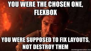
We came to the end of the section. I hope you enjoyed the article. The above picture is a small disclaimer to the flexbox newbies, just keep careful while playing around with the flexbox🤭.